Book Covers in Translation
Our columnist reviews a range of translations of the fourth book in Elena Ferrante’s Neapolitan Quartet, looking at how book cover design can change from language to language.
One of the fascinating if less-discussed aspects of literature in translation is just how much a book’s cover design can change from language to language. Although publishers are free to license a book’s original cover for subsequent foreign-language editions in theory, in practice that usually doesn’t happen. The reasons vary, but most publishers know what works in their own market much better than does a press from a foreign country.
So, how do publishers pick the covers for translated literature? According to French theorist Gérard Genette, book covers serve three main purposes: to grab a potential reader’s attention, to communicate something fundamental about the book, and to tell a reader what genre the book fits into. These three objectives offer some overarching, guiding criteria.
We then encounter the question of foreignizing versus domesticating strategies, to invoke Lawrence Venuti’s two theoretical positions: just as translators face choices about how much to bend a translation toward the target culture, so too do publishers when they create their cover images. In the paper “Representations Are Misrepresentations,” translator and scholar Hiroko Furukawa explores this concept by looking at covers of various English-language editions of Japanese author Banana Yoshimoto’s first novel, Kitchen. Publishers from dominant cultures, she argues, tend to take liberties in appropriating aspects of a translated culture to suit their own beliefs about it.
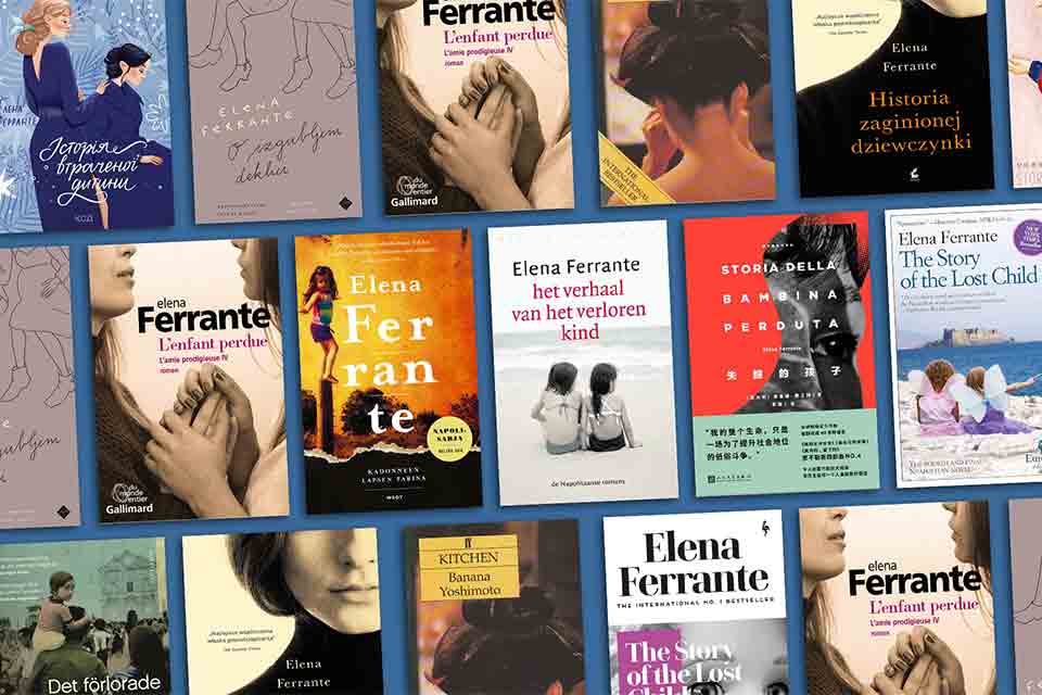
I evaluated how publishers from a range of nations worked through Genette’s and Furukawa’s criteria. To do this, I picked a test subject: the fourth book of Elena Ferrante’s Neapolitan Quartet, The Story of a Lost Child. I picked this book because I wanted something by a high-profile, easily recognizable international author as well as a book that had been translated into lots of languages. I found thirty-one translations of The Story of a Lost Child, including most major European languages, Japanese, Korean, Chinese, Persian, Hebrew, Arabic, and Russian.
Furukawa offers some guidance on how to proceed: in her paper, she first examines the UK edition of Kitchen, which shows a geisha’s head, noting that no geisha appears anywhere in Kitchen. She further observes that the cover image has undeniable sex appeal, in spite of no sex happening in the book. Furukawa reads the overall feel of the UK cover as melancholic, in contrast to the book’s cheerful, happy-go-lucky protagonist. She concludes that the UK cover design “is adjusted to a Western stereotyped mould; an image with exotic sensuality and unrestrained sexual pleasure, irrespective of whether or not it relates in any way to the content of the novel.”
The cover image of Kitchen has undeniable sex appeal, in spite of no sex happening in the book.
Furukawa then evaluates the US cover, finding it much more accurate to the text: it features a compelling young Asian woman who could convincingly stand in for the protagonist. She sees this cover as charting a middle course between domestication and foreignization, making some concessions to the US audience but also doing a decent job of respecting the book’s cultural context.
So let’s apply Furukawa’s analysis to the Ferrante covers. Unfortunately, we are not able to do a head-to-head comparison of the US and UK editions of Ferrante, since Europa Editions published the book on both sides of the Atlantic and chose the same cover for each. For the initial English publication, they opted to retain the book’s original Italian cover, which shows a somewhat fantastical from-behind image of two girls in pastel dresses, sporting fairy wings, leaning against each other on an island. The smaller of the two girls stretches out her arm, waving a wand as though casting an enchantment. In the distance sits a castlelike structure on the mainland.
Perhaps Europa was comfortable retaining the original cover because it doesn’t scream “Italy!” Although I do wonder how well it fits Genette’s observation that a cover should indicate genre. (I’ve long felt that Europa’s covers don’t indicate the high literary heft of its more serious authors, The Story of a Lost Child included.) This cover doesn’t communicate that you are about to read the words of one of the leading literary voices of her time. Perhaps in Italy, this comes across as a more literary cover—if so, then Europa chose to foreignize its cover, possibly out of respect for the original text.
A fascinating quote from an interview with Sandro Ferri, Europa’s publisher, suggests that the covers are purposely bad:
Writes Ferri in an email to Quartz, “The ‘vulgarity’ is our intention. We don’t want to make the typical ‘literary’ cover designed for an audience of ultra-sophisticated readers. . . . Ferrante’s novels are a mix of popular literature and highbrow, intellectual writing. We want to communicate this though our covers as well.”
However, the publisher did release a reissued edition of the book with an updated cover, and this one does make some interesting concessions to the anglophone market (or perhaps just good taste). For starters, the updated cover heavily emphasizes Ferrante’s name, dedicating the top third of the cover to that alone, declaring her “The International No. 1 Bestseller.” No surprises there—by the time this reissue was released in 2020, Ferrante was about as famous as an author in translation could be.
The image features a black-and-white photo, a tightly cropped closeup of a wide-eyed doll’s face—about as different from the dreamy, childish original as you can get. It comes across much more like the cover of an anglophone literary paperback and is therefore a much more domesticating cover. Furthermore, the doll is distinctly white-skinned and blonde-haired, without any hint of the Mediterranean features one might expect of the novel’s Neapolitan protagonist. The doll might at first seem to play on the theme of lost childhood innocence that runs through the quartet, but the shot composition uses the tight cropping and assertive look on the doll’s face to create a much more mature feel. In its innocence-yet-maturity, the cover seems to capture the telescoping nature of the relationship between the book’s frenemy-protagonists—Lenù and Lila—and how their childhoods together are caught within the complexities of their adult relationships.
In short, the image works. Even if it doesn’t point to the book’s origins in southern Italy, it also doesn’t do anything terribly offensive, like the UK edition of Yoshimoto’s Kitchen. Considering the totality of the two covers—the US and UK Lost Child and the UK Kitchen—one wonders if the relatively greater respect paid to the Italian original is indicative of a greater cultural humility developing in the field of translated literature in the two decades since Kitchen was first published in English. It might also indicate the respect paid to Ferrante—recall that Yoshimoto was just twenty-nine when Kitchen was first translated and had not developed anything like the reputation Ferrante held by the publication of Lost Child.
One wonders if the relatively greater respect paid to the Italian original is indicative of a greater cultural humility developing in the field of translated literature in the past two decades.
How do the many other covers of Ferrante’s work compare to these two English-language ones? Examining them, a few themes jump out immediately. Many covers—such as the Lithuanian, Turkish, and Swedish ones—highlight the theme of girlhood with whimsical images designed to communicate the idea of dreamy summertime days. Interestingly, the Danish and Norwegian editions use the same cover image: that of a young girl lost in her explorations of a gorgeous summer beach. Somewhat oddly, the Swedish cover features a mother and father to the little girl—it’s the only cover I found to include parents, and by the fourth book the series has long moved past Lenù’s parents.
Other covers, such as the Persian, Chinese, Croatian, and Polish ones, eschew childhood completely and showcase the image of a powerful adult woman. These covers bend toward domestication, as the women featured on them are more reminiscent of the books’ target culture than the original Italian. The Spanish cover is an outlier, showing a sexy young woman—an odd choice, since by Lost Child Lenù and Lila are moving through their thirties to their sixties. It’s a clear attempt to garner reader attention but at the cost of communicating the novel’s plot.
Another popular choice was to highlight the story of female friendship. This harked back to the original Italian cover, which was very much about shared girlhood. The Estonian and Dutch covers also sport two young girls. The French, German, Japanese, Russian, and Ukrainian covers (the last two are duplicates) highlight the relationship between the women as adults. These covers breathe out a distinctly melancholy feel, indicating this is not the story of a happy friendship, nor one with a neatly resolved ending. The French cover, in particular, with a closely cropped image of two women clasping hands amid a confrontation, seems to highlight the tense and very rich emotionality of the relationship.
Interestingly, in the context of Lenù and Lila’s relationship, the Slovenian cover makes one—or arguably both—of the women pregnant in its line drawings of two female friends; in addition to the Korean cover—in which one of the women holds a baby—these were the only two highlighting pregnancy and children, central parts of the fourth book’s storyline.
The garishly pink Serbian cover features the confusing image of an abstract drawing of two mirrored buildings clutching dolls.
There are also outliers. The Finnish cover makes Ferrante’s name the centerpiece, breaking it into syllabic chunks: Fer-ran-te. (The girl on the cover’s left side seems almost an afterthought.) The Romanian cover seems a misstep, as what catches the eye is a man in soft focus rubbing his forehead as if about to have a headache—while the image of a girl with her back to us is lost in the crowd behind him. The garishly pink Serbian cover features the confusing image of an abstract drawing of two mirrored buildings clutching dolls. I’m curious to know if this is some indication of the Serbian market for book covers.
Finally, a new English-language edition of the Neapolitan novels will be published in October: a 1,200-page hardcover encompassing all four books. The cover simply reproduces the first two sentences of the series (after the book’s prologue) in a dignified serif font in warm purple on a dark-blue background. A rare honor for Elena Ferrante: at last, her writing stands as its own best advertisement—no attention-grabbing image needed.
Oakland, California